Happening Now
Check Out This Cool New Map!
April 12, 2024
By Jim Mathews / President & CEO
Corridor ID, Fed/State Partnership-NEC, Fed/State Partnership-Network, existing network, new routes, new routes on old routes, baseline new network, enhanced preferred network, preferred LD route network...you can be forgiven if you think it’s all a blur. But thanks to Rail Passengers intern Noah Kahan, we now have a tool to help you visualize what this all means for passenger rail in this country, now and in the future.
Obviously, the idea is to see the before-and-after if we were to commit to decades of steady passenger rail investment in the same way that we did for the interstate highway system (40 years, $220 billion, is what the highways cost to build, along with countless billions since then to top it up and fill potholes). The Bipartisan Infrastructure Law was a great down-payment on that vision and we’re already gearing up to get the BIL reauthorized with the same framework in the current legislation – two-thirds guaranteed “advance” appropriations and one-third authorized and subject to an annual appropriations process.
But it’s hard to see through all the acronyms and funding streams and buckets to understand what the ultimate outcome might be. Noah, a Masters in Urban Planning candidate at Harvard University's Graduate School of Design, has done a genuinely terrific job telling this story visually, and it’s available to you online for you to use whenever you go to talk about rail with your local elected and appointed officials, the district office of your member of Congress, or even just family and friends as you spread the word about passenger rail.
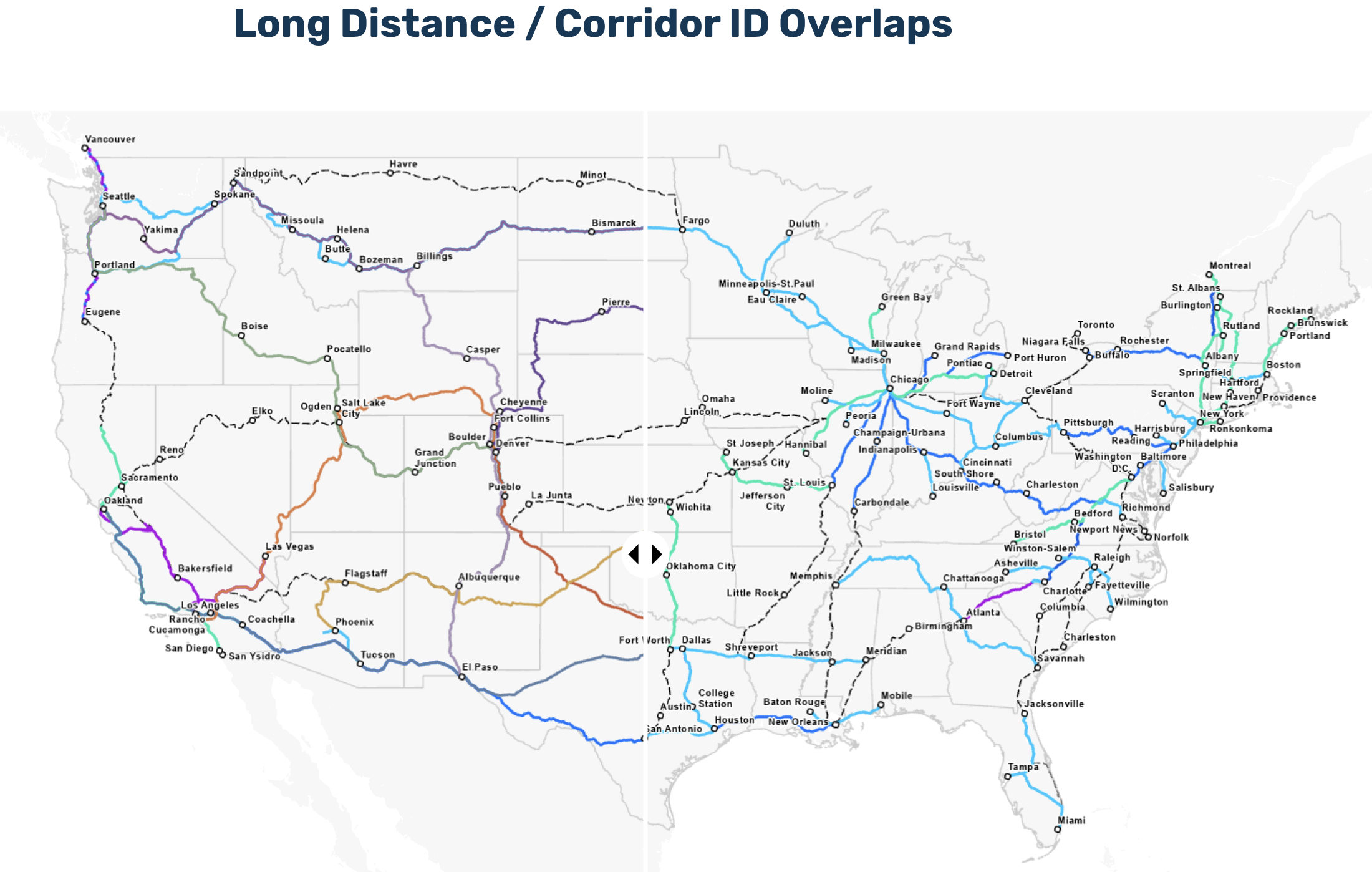
Here's how it works:
It’s all one file, and you just scroll down to see the next portion. You’ll see a few maps with a big straight line running from the top to the bottom of the page, along with triangular arrows on each side of the line. That’s the slider you use to move back and forth across the map. When you do that, you’ll reveal each of the map’s topics both before and after a given program or investment.
There’s also a lot of research and commentary and explanation alongside these maps, embedded in the storymap document itself.
If a picture is worth a thousand words, then an interactive map might be worth 10,000. Go look at this map today and let us know how it works for you. If you really like it, let us know that too so that we can pass that along to Noah! Also, check out his infrastructure podcasts by clicking here.
CLICK HERE TO ACCESS THE RAIL PASSENGERS STORY MAP
(Oh and one more thing? I've noticed that readers still don't click on the links we put in these items...but they send me emails asking for the underlying documents. Trust me, click on the links! We've included them so you'll have more context and background. If you don't click, you're missing out!)
"I wish to extend my appreciation to members of the Rail Passengers Association for their steadfast advocacy to protect not only the Southwest Chief, but all rail transportation which plays such an important role in our economy and local communities. I look forward to continuing this close partnership, both with America’s rail passengers and our bipartisan group of senators, to ensure a bright future for the Southwest Chief route."
Senator Jerry Moran (R-KS)
April 2, 2019, on receiving the Association's Golden Spike Award for his work to protect the Southwest Chief
Comments